Veggieat
Mobile app
Concept project - Two weeks sprint
Veggieat was born after I paired up with a peer with the finality of finding a problem he had, and solve it with the creation of a
mobile app.
During this process, I conducted user research, created user journeys, and explored different concepts such as ideation and creation of user-flows and wire-flows. I also learnt to create low fidelity and high fidelity wireframes and prototypes.
All this resulted in an app that motivates the user to improve his eating habits by providing a healthy and personalised nutrition plan with carefully selected recipes.
Final delivery: Mobile hi-fidelity prototype.

Hi-fidelity prototype
Full Case Study
Veggieat - Mobile app

The Brief
At General Assembly, I was given a task to develop a project throughout two weeks. The mission was to identify a problem faced by a classmate and to solve it by creating a mobile app.
I started by writing a collection of open questions to interview my user with the finality of finding out if there was any problem which I could help him to solve with the creation of a mobile app. During the interview, he mentioned a few issues that he encounters in his daily life.
The one that we decided to focus on was a bad eating habit that he wanted to improve.

Problem Statement
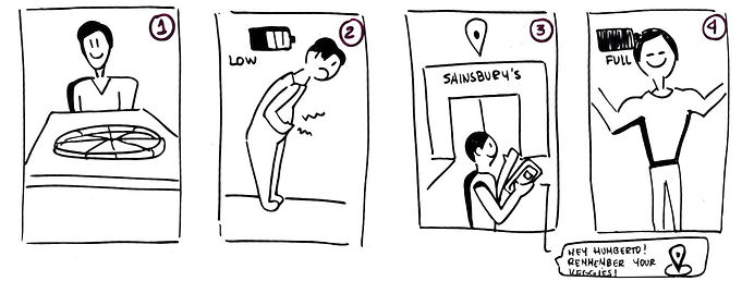
Humberto wants to incorporate more vegetables in his diet; due to his busy agenda and taste for cheese and fast food, he forgets to buy vegetables and fruits. He also doesn’t like a wide variety of vegetables which make cooking healthy meals a tedious experience for him.
Meet Humberto
-
30 Years old
-
Busy life
-
Student
-
Smoker
-
Likes cheese and fast food
-
Wants to eat more vegetables
Goal
-
To build an app that reminds Humberto to add some vegetables to his weekly shopping.
-
To create a customisable meal plan to make it easier for Humberto the inclusion of more vegetables into his diet.
-
Provide Humberto with an option to choose the vegetables he likes so that the ones he doesn’t want, can be excluded from the recipes.

Humberto's experience map
Assumptions
Humberto forgets to buy vegetables and ends up having cheese food for dinner. After dinner, he feels uncomfortable and with low energy. With an app that gives Humberto personalised recipes and also reminds him to buy his vegetables, he will feel stronger, healthier and happy.
Story Board — Assumptions
Process
I started by studying the competitors and similar apps in the market. There are many recipe apps, but none of them can offer a customised meal plan and choices depending on the tastes and needs of my key user.
Once I had a better understanding of my users’ needs, I moved into the next step which was to create a wire flow and a wireframe of Humberto’s “Happy Path”.
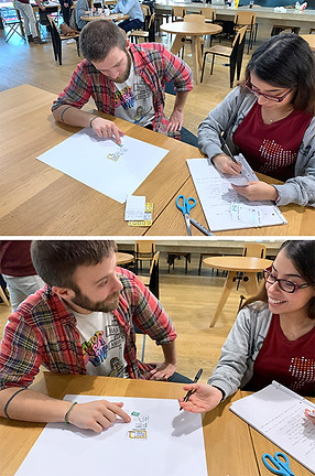
From the wire-flow, I proceeded to create a paper prototype that I tested with Humberto and 3 other potential users.
After the users’ feedback, I made some key changes to the screens. I sketched the new flow which I tested again, this time with an interactive prototype that I put together in the mobile app Marvel.


Iterations
From the initial testing round, I got very interesting and insightful feedback that I proceeded to apply in the first iteration. One of the main iterations was the reduce the number of screens during the on-boarding, leaving only the essentials to get get the user started.

Initial Paper Prototype

First Iteration
After the second testing round, I got very interesting and insightful feedback that I proceeded to apply in the next iteration. I implemented the changes into a mid-fidelity prototype so I could then conduct another round of
usability testing.
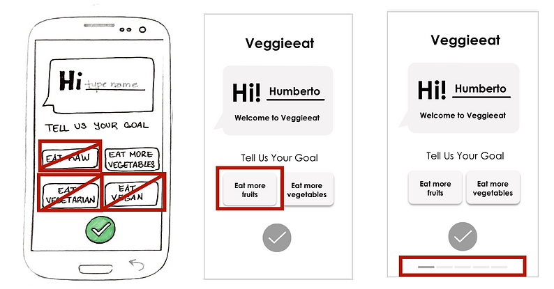
Clickable options and Location Bar
Key changes
-
I changed the clickable options from vegan, vegetarian, raw and vegetables to only two options; fruits and vegetables. One of the reasons to do that was because my key user had no interested in the first dietary options chosen.
-
I added a location bar through the process of on-boarding so the user can know where in the process he is located.

Demonstration of different text sizes & quantities and pop-up instructions
-
I modified the text quantity and size for accessibility purposes. It also made the app look too busy and overwhelming.
-
I added a pop-up text to make some of the icons on the screen more clear for the user.
UI Design
Once the user flow was clear and easy for the user, I moved into creating the look of the app. My first step was to develop a brand personality and voice description.
Once it matched my users’ needs and taste, I then proceeded to create a mood board which helped me to choose the brand’s colours and typography.
Brand Personality
Fresh / Bright / Energetic / Revitalising / Healthy and Slightly Fun

Brand Affinity
Voice Description
"Because you care about your health so do we!
That is why we are here to help you achieve your goals by being encouraging and reliable.
We are flexible but not wishy-washy.
We are enthusiastic because eating healthy is fun and exciting!"

Veggieeat mood board

App style guide
Hi-Fidelity Prototype Iterations
-
I changed the original green tone after I proofed the colours for their accessibility with consideration to how colour blind people may view the app.
-
I changed the tick mark button only to turn on green one the user completed the questions from each section; This made it more evident to the user when to press it.
-
I added a splash screen so the user could have a better look at the App name when accessing it.

Testing for colour blindness- Deuteranopia-Type
Results
I successfully met my users’ needs by creating an app where Humberto can get a personalised meal plan including only the vegetables he likes. He can also choose how long he wants to spend cooking and the length of his meal plans.
He has the possibility to get reminders of when to do his shopping, as well as saving his favourite recipes. Another plus is that he can easily replace any recipe by swapping between them depending on his daily mood and taste.
Achievements
-
Now Humberto eats more vegetables.
-
Humberto gets to pick from exciting meal options.
-
Humberto feels stronger and healthier.
Hi-Fidelity Prototype walkthrough
Next Steps
After testing the Hi-Fi Prototype with my user and many potential users, I found some extra opportunity areas that I could improve:
-
The option of getting notifications to remind the user to buy vegetables when he is near his selected supermarket.
-
Develop the brand style guideline, including a logotype and the UI kit.
-
Include a budget filter to meet the need of students and users with lower income.